Viktor Ganzha
LEVEL DESIGNER
LEVEL DESIGN SHOWREEL
PROJECTS

Counter-Strike 2

Far Cry 5 (Not official)


Necroshift

Viktor Ganzha
Hey! I'm a Level Designer with 1 year experience as Game Designer. I was born in Warsaw, Poland, but grew up in Moscow, Russia.
I am currently studying in the Game Design program with a specialization in Level Design at Futuregames, Stockholm.
Before joining Futuregames, I completed my bachelor's degree in Marketing and PR at the Moscow Aviation Institute.
My toolset includes:
- Researching (Games, Movies, Real Places)
- Sketching (Top Down/Figma, 3D/SketchUp)
- Block-outs (Unreal Engine, Unity, Roblox, Hammer)
- Scripting (Blueprints, C#)
- Level Environment
WHY LEVEL DESIGN?
Of course, like many others, I began my journey simply by playing games. I remember, as a young boy, playing Rayman 3D, NFS Most Wanted, and Psi-Ops: The Mindgate Conspiracy. I was just enjoying the process of playing on my Xbox Original (that big black box), without ever thinking about how these games were actually made. It was an amazing time, to be honest. I think back then I experienced the most intense emotions from games.As time went on, I learned about game engines, programmers, artists, game designers, and level designers. Like many aspiring developers, I tried everything. But I quickly realized that programming wasn't for me. 3D modeling was interesting, but also not quite my thing. But level design immediately caught my interest. I was always drawn to the creative area. That's why my first education was in marketing — I enjoyed solving problems through creativity, thinking about unconventional solutions, and how to engage the consumer.In my opinion, games and advertising are similar in that they both try to capture the consumer's attention. And whoever holds that attention and piques their interest wins the battle for the consumer. Then the question becomes, how do you capture that attention? What tools are available for that? It's actually fascinating to think about and discuss, though that could turn into a long message.I just want to say that I've found my way of expressing this in game design, specifically in level design. I enjoy thinking about how to guide the player to do things that will lead them to a moment where they’ll feel the same emotions I did as a kid, playing my games on that old Xbox.
WHAT ELSE?
Besides video games, I also love sports, like hockey (though that's a game too). I played hockey for a long time, so whenever I get the chance to skate or play, I take it.
I mainly go to the gym to stay in shape, but when I lived in Malaysia, I tried Muay Thai. I enjoy practicing it as a form of fitness to keep in shape.
In my free time, I also enjoy writing music. I like instrumental music, beats, and electronic music. For this, I use Ableton Live 10.

SKILLS


ABOUT CHERNOBYL
First-Person Horror
Chernobyl is a prototype of a first-person project, where the player finds themselves inside a nuclear power plant during an incident. The level features interactive objects, triggers, and a cinematic event.
PROJECT ROLES

1. I developed an original idea and created a level that would reveal this idea.
2. I designed a single level by creating a blockout, implementing triggers through blueprints that support the narrative.
3. I conceptualized and implemented a health system and checkpoints, along with interactive objects that were used throughout the level.
4. I added lighting, VFX, and sound that support the narrative and assist in navigating the level.
OVERVIEW
Here are some of the final results. Everything in this level was created by me using Unreal Engine 5. The level was built using a modular kit, specifically the starter content from Unreal Engine. I also set up the lighting and used free VFX from the Unreal Marketplace. Additionally, I incorporated animations from Mixamo and free sound effects from freesound.org.


LEVEL FLOW

TENSION GRAPH

WORKFLOW
The first thing I did was create a small game design document (using a template from Steve Lee), where I outlined the theme, mechanics, objectives, and gameplay beats. This helped me establish the right scope and work according to this document from day one.I also found references that guided me in understanding the architecture of the level and the approximate dimensions of the Chernobyl station.
GAME DESIGN DOCUMENT

REFERENCES

TOP DOWN
I also started creating a top-down map. I made the first sketch on paper to roughly understand what the level would look like.Then I made a 3D map in SketchUp. The map turned out to be quite compact, which helped me understand the approximate metrics of the rooms and space. SketchUp LinkIn the final version of the map, I added some rooms and passages. Here are the level beats:
1. Start testing
2. Help Ivanov
3. Bring Ivanov into the Control Room
4. Go to the next level
ITERATION 1

ITERATION 2

ITERATION 3

METRICS/PLAYER GYM
For metrics, I used a modular kit. This allowed me to quickly and easily create a blockout, as well as easily modify levels and make new iterations.

DESIGN INSIGHT
CHALLENGE 1: GUIDING PLAYER
Throughout the design of my 'Chernobyl' map, I aimed to make navigation as simple and intuitive as possible. To achieve this, I used the following level design tools:1. Guiding the player with light.
2. Using sound.
3. Utilizing assets.
4. Employing proper viewing angles.
5. Using UI (task list).

EXAMPLE 1
The first principle I used is the player perspective. This ensures that the space in my level is designed so that the player can immediately see the next objective.1) In the first screenshot, you can see that as the player exits the staircase, they immediately see the door; the door is directly in the player's line of sight.
2) In the second image, the reactor room is shown. When the player enters the room, they immediately see the NPC they need to help. Moreover, the player can also instantly see the path that leads to the NPC.
3) In the composition on the third screenshot, you can notice that the player immediately sees four key elements:
A. A breach in the wall that leads to the exit.
B. A blocked passage through which the exit is visible.
C. The NPC who needs help.
D. The path back (which will close when the player approaches the NPC).


EXAMPLE 2
The second principle I used is guiding the player with light.1). In the first image, an alarm light is shown. It is present along almost the entire path (up to the point of entering the additional room) and serves as a kind of guide for the player. This way, the player gradually learns through gameplay that this light acts as a helper.
2) In the second image, you can see the final objective, which teleports the player to a new level. Since the player has already learned to follow the light, this objective stands out quite prominently. Moreover, guiding with light works well here because the room itself is fairly dark.
3)In the third example, you can see a lamp that illuminates a secret passage for the player. First, the light from the lamp falls on the passage, and second, the object itself is quite noticeable. All of this helps draw the player's attention to this area.
You can also see a video example.


Video Example
EXAMPLE 3
In the final example, I want to demonstrate how I guided the player using UI, sounds, and props.1) In the top left corner, the player can see the missions they need to complete. Once the player accomplishes one mission, a new one appears. This gives the player a basic understanding of what needs to be done.
2)In this example, you can see how wires serve as a guiding lines for the player. I also used pipes on this level.
3) I used 3D sounds to guide the player toward the objective. For example, in the video, you can hear an NPC asking for help. Since the sound is 3D, it’s easier for the player to orient themselves in the space and locate the NPC.


CHALLENGE 2: SCRIPTED
EVENTS
EXAMPLE 1
On this project, I also wanted to work with scripted events. I used them both for the narrative and for the gameplay.1) In the first video, you can see the interaction with the red button. This button starts the game. The initial room has three doors, and until the player interacts with the button, they won’t be able to open the door that leads to the next location. I made all the doors locked at the start to ensure the player couldn’t disrupt the intended game flow. This button also activates other events, which I will explain in the next example.
2) I also created an event with debris that falls during the fire and blocks the main passage, forcing the player to find another route. In one instance (when the player enters the reactor room), the debris not only blocks the player's path but also creates a new passage. I did this because I wanted to make the game more varied and the progression less linear.
3) In the third video, an event is shown that opens a door that is initially locked. This prevents the player from opening the door at the start, pushing them to explore the area. Additionally, this event allowed me to create a complete loop, where the player returns to the beginning and discovers a new location they can now access.
EXAMPLE 2
This example shows how the environment changes as the game progresses:1) Control Room: At the beginning of the game, the room is intact, but as the game progresses, the player triggers an event that activates fire and places boxes in the passage, making it impossible to explore the area again. I did this to convey the narrative that the station is falling apart and that the player needs to hurry toward the exit.
2) In this example, I wanted to show how the lighting changes based on the player actions. For instance, the red button activates the alarm light. Additionally, an event in the collider room changes the lighting in the control room to red. I chose the red light to help create a sense of fear.
3) My goal was also to change the atmosphere as the game progressed. I wanted to show the progression of the narrative. To achieve this, I used triggers for animations and cinematics. In the first part, the control room appears clean, with bright lighting, people working, and an overall friendly atmosphere.In the second part, the animations change: people are floating in the air, the lighting shifts, and you can hear eerie music. The cinematic at the start reveals the horror that has unfolded, as well as a new passage that was previously closed. Essentially, the composition transitions from a friendly atmosphere in the first part to a sinister one in the second.
CHALLENGE 3: ADDITIONAL PATHWAYS
EXAMPLE 1
This example shows how the environment changes as the game progresses:1) In the first version of the map, there was a lack of meaningful variety in pathways, so I decided to change the map. To address this, I added a new passage that brings the player back to the starting point via a different route.
2) I also decided to add moments where the player needs to crouch. I did this to add variety to the gameplay. Additionally, it changes the player’s perspective. Moreover, these areas feel more confined, which can evoke a sense of claustrophobia, something I believe is effective for a horror game.
EXAMPLE 2
Also, because the level is quite linear, I decided to add more alternative paths.1) In the latest iteration, I decided to add a secret passage in the destroyed room. I did this to give the player multiple ways to complete the level. I also wanted to reward players who choose to break from the previously established path (guided by the emergency lights) and explore this less obvious area.
2) In this example, you can see how debris blocks the player's path, but this doesn't mean a dead end, as the player can use the ventilation system to return to the correct route.
3) During playtests, I received feedback that the passage in the collider room was too long. As a result, as I described earlier in the scripted events, I added a shortcut that shortens the path and maintains the game's pace.
ITERATIONS
REFLECTION
This project has probably been the most useful for me in terms of learning, as I gained a lot of knowledge.Firstly, I understood the importance of creating a quick top-down map. The top-down map doesn’t need to be the "final version" of the level. It should serve as a rough guide for both me and the team.Secondly, I learned how to work with metrics and perform quick grey-boxing. I created the first version of the level in just an hour using the starter content pack (modular kit) and a 100-unit grid in Unreal Engine 5. Moreover, the modular kit allowed me to iterate quickly, resulting in 4 iterations of my level without taking much time.Thirdly, I realized the importance of feedback and playtests from day one. Without the feedback from my colleagues and my instructor, I don't think the level would look the way it does now.Finally, I want to thank my instructor, Tid Cooney , for the feedback and the knowledge about level design and the role of a level designer that he shared with us. I also grateful for my colleagues at Futuregames for helping me test this level and providing a lot of useful feedback.I’m glad that I made those initial mistakes during the learning process (like backtracking in the first version of the level and having objects not align with the grid at the beginning) because I was able to correct them and find solutions. I feel much more confident in my role as a level designer after this course. I am very pleased with the outcome and look forward to applying the knowledge I’ve gained to my future projects!
ABOUT CRYPT OF FEAR
Crypt Of Fear is an FPS co-op horror game where two explorers navigate ancient Egyptian ruins to gather treasure for their research.Together with a friend, you delve deep into ancient Egyptian ruins in order to recover the remains of an old pharaoh that are hidden inside different jars spread across the old ruins.WEAPONS
In this game, you can find several rifles and a shotgun, along with ammo scattered across the map. These weapons can help you escape from this terrifying place!ENEMIES
This dungeon is filled with many enemies, so be careful! Play in co-op, search for medkits and weapons to stand a chance against your foes!ENVIRONMENT
The level contains several traps and secret passages. Stay alert and cautious. Sometimes the environment is your ally, but other times it’s your enemy. It all depends on how you use it.
PROJECT ROLES

1. I created the initial level design, focusing on making movement easy and intuitive, without any dead ends.
2. I developed one of the two levels by making the blockout, placing AI, and balancing the gameplay, while ensuring a seamless connection with the level created by the other level designer.
3. I came up with and implemented traps and interactive objects, which were utilized throughout the entire level.
4. I handled the environment art, finding suitable assets and textures that fit our theme. I also aimed to make the space as varied as possible, so the player could distinguish between different zones and know where they were.
WORKFLOW
RESEARCH
Researching Egyptian dungeons and ruins to understand their appearance, analyzing both real examples and artistic representations of ancient Egypt. I focused on the architecture of the rooms, their dimensions, and the lighting.
METRICS

For this project, we used 4-meter by 4-meter walls.
GAME LOOP
My team and I created a small game flow and a rough sketch of how the map should look. We decided that players should have a safe place where they start and finish the game (similar to the ship in Lethal Company).This was done for three main reasons:1. Narrative factor – Players are explorers who need to find loot and return.
2. It allows players to learn the map with each expedition, making it easier to find their way back.
3. Players can use the glow stick mechanic to mark their path and return or to designate areas they’ve already visited.

Untitled

TOP DOWN MAP
This time, before starting on the top-down map, I decided to experiment with creating some spaces directly in the engine. I ended up designing a cave, a starting room, a corridor, and a room with pillars. I used these as a foundation, and only after that did I make the first sketch of the top-down map.

Iteration 1


After I started creating spaces in Unreal Engine, I conducted a few playtests. Based on the feedback, I gained a clearer vision of the map. The most important realization was that there should be a room encircling the entire map, helping the player return to the start. In other words, the corridor around the map serves as a guide for the player, signaling that they are on the right path.

DESIGN INSIGHTS
DESIGN TECHNIQUES
GUIDING THE PLAYER
I decided to use fire to indicate places where you can find loot or weapons/ammo/first aid kit.
I also lit up the main room to show that it is the center of the game.
WORKING WITH SPACE AND COMPOSITION
My task was to make the rooms as different as possible so that the player could understand where he was approximately even without a map. To do this, I made a large open room, an interactive room, a dungeon with secret passages, a labyrinth and much more.
ADDITIONAL AND SECRET PATHS
All spaces are connected. Sometimes it's obvious, and other times you need to be attentive to find these paths.
SCRIPTS
I decided to make simple interactive scripts that will help diversify the level. I made them in blueprints and then the programmers on my team made them better.
BLUEPRINTS EXAMPLES


BLOCKOUT & PLAYTESTING
REFLECTIONS
This was my first experience creating a map for an online game, especially in the horror genre. It was a cool challenge during which I ran into some problems.The first problem was in navigation, the task was to make sure that the players understood where they needed to return, but at the same time we did not want to add a map. After several iterations, it was decided to add a corridor that would connect the boundaries of the dungeon and the start. This greatly improved player navigation in the dungeon.It was also discovered during playtests that players sometimes did not notice how some interactions worked. To do this, we added sound to each interaction, and I completely redesigned some interactions to improve their visibility.Also, after playtests, it was decided to diversify the rooms, since the feedback was that many rooms were similar to each other. I then decided to add a large main room to make the dungeon feel incredibly huge. With this room I tried to convey the power of this place.I also decided to add a maze to make the player feel claustrophobic. Moreover, in this location it is more scary to meet the enemy, since the passages are narrow and you need to act faster.Overall I'm happy with the project, it was a good experience and I learned a lot. It was interesting to design the map and think about what kind of experience and what emotions players should feel in this or that part of the map. I am grateful to the team and all the people who took part in the playtests.
ABOUT OBJECT 11402
The main concept of the game is that the entire world is actually a laboratory, and the player is an experiment, though they are unaware of this. The world consists of portals through which the player travels across different time periods. The player doesn't know which world will come next, but they must keep moving forward, searching for a way out of the maze of worlds to escape this hellish loop.
PROJECT ROLES

For this project, I developed a level prototype, which I then implemented. I started with a top-down map, followed by creating the first blockout and simple mechanics, such as opening a secret door and using a flashlight. After playtests, I realized the level was too small, so I added more rooms in the second iteration. However, after further playtests, I understood that my level lacked verticality. I then revised the map again, adding an underground floor. After that, I adjusted the lighting and worked on environment art. Additionally, I introduced more complex interactions, such as opening doors with keys, interacting with a box where the key can be found, a damage system and checkpoints, as well as unlocking doors using a specific code.
WORKFLOW
REFERENCES

Before I started working, I found references on which I then based my work.
TOP DOWN MAP
This is the first iteration of the top-down map, where I placed the main events.


This is the third and final iteration of the top-down map. Here you can see how the map has changed after all the playtests and iterations. I added verticality to the map, more events were introduced, and a small level scenario was developed.
DESIGN INSIGHTS
CHALLENGE 1: HORROR LEVEL DESIGN
When creating the level, I aimed to evoke emotions of fear, horror, mystery, and curiosity in the player. I also used several level design techniques to amplify these emotions during gameplay. These techniques include:1. Lighting
2. Secret passages
3. Jump scares
EXAMPLE 1
In the first example, I wanted to demonstrate how I used lighting to make the scene feel darker and more unsettling. The image shows a person inside a box enclosed with glass. Under normal lighting, it would look like an ordinary lab setting. However, the red light adds a sense of unease. The light only illuminates the silhouette, and the glass blurs the image, preventing the player from fully identifying what the object is. The silhouette appears human, but people don’t typically reside in a metal, frozen box, which creates a feeling of horror.

Here, the red light is used again, but this time in a prison cell. A prison cell on its own already causes discomfort, but when combined with red lighting, it transforms into something truly horrifying.
In the third image, you can see white light. White light doesn't evoke anxiety and is often associated with safety. This zone is indeed a safe area, and the white light communicates this to the player.

EXAMPLE 2
In this example, you can see a secret passage that activates when a special trigger is pressed. The main goal was to create a horror game, but as I mentioned earlier, the theme of the level was a "Secret Abandoned Hospital". So I felt it necessary to add unexpected passages that the player could activate through some kind of trigger. This passage leads to an optional area that is not required to complete the level.
There is also a door with a code that opens a passage to an important part of the map – a secret basement. I decided to create this door to diversify the player's experience. I made the Blueprints and UI for this door myself.
EXAMPLE 3
I'll say right away that I haven't made any animations or triggers for this zone yet, but I would like to explain the idea. I wanted to add screamers to the game, and for this, I created a specific zone. The idea is that just before the exit, the player encounters creatures that are breathing heavily. These creatures jump at the player if they get too close. I was inspired by this scene from the movie "I Am Legend."
CHALLENGE 2: ART PASS
My Level Environment for Object 11204 was focused on bringing the grey boxing to life. I aimed to make the environment as realistic as possible. Additionally, the goal was to make the building scary and secretive, adding elements in certain areas for narrative storytelling.
BEFORE:


AFTER:


EXAMPLE 1
One of the main challenges in creating the level environment for Object 11204 was designing unique rooms that would help with visual communication for the player. This means the player could remember these rooms and understand whether they had already been in that room or not.In the first screenshot, you can see the starting area, located on the first floor. The space and assets work together to show the player that this is an abandoned space. I used Modeling Mode to add windows and create holes in the ceiling. Decals from Quixel were very helpful. I used debris, graffiti, and broken decals to achieve the feeling of an abandoned place.

In the second screenshot, you can see an operating table, which lets the player understand that this is an abandoned hospital. Here, I also used assets from Quixel, as well as assets from the Dungeon Pack, which I got from the Unreal Marketplace. However, I had to create some assets myself, like the operating table, cabinet, and lamp. I made them in Unreal using Modeling Mode and then applied textures.

In the third screenshot, you can see the underground area, which is completely different from the first-floor area. You can see that the walls are carved out of stone, as if this place was made inside a mountain. The main goal was not only to make this area scary but also to show that it’s a secret location. The player should feel like they’ve seen something beyond what’s available to the average person.For this scene, I used assets from Quixel. I was curious to experiment with creating a secret underground lab, which somewhat resembles a bunker.

In the final screenshot, I wanted to showcase the doctor's office, located on the underground floor, which can only be accessed via a key. Here, I added many unique and small details, such as photographs, posters, luxury items, and plants. This area stands out significantly from the others, yet it fits perfectly into the narrative of the story.

ITERATIONS
REFLECTION
This was a great project where I was able to learn how Unreal Engine 5 and blueprints work. I made several iterations of the level because in playtests I discovered the importance of verticality of the level. Other game designers gave me feedback about my level, such as that the first iteration didn't quite feel like a secret abandoned hospital, so I decided to change the level's sequence.I was also able to explore the level environment in Unreal Engine 5. I worked with decals and assets from Quixel and the Unreal Engine Marketplace, and I also focused on lighting.Overall, I'm happy with the project; maybe later I'll add AI and enemies to make this level complete.
DESIGN DECISIONS
SHORTCUTS
I tried to implement classic shortcuts that allow players to shorten their path, but at the same time come with higher risks.This adds variety to the gameplay and gives players a chance to showcase their skill.
SCRIPTED EVENTS
I also tried to create a drawbridge as a reference to Fast & Furious 2 and NFS Underground. I made a mini-version of the bridge since I didn’t have much time to work on the car physics. But the main purpose of this bridge is to challenge the player—they need enough speed to jump across it. It’s a small gameplay challenge.
FEEDBACK
Post-mortem feedback from Paris, (ex-Arkane level designer, now at Valve.)
Congrats on completing the jam! Seems like you learned a lot in the way of creating your own project from scratch, even if you found it constraining. Next time if you're wanting to work more with a prebuilt toolset, the Half Life 2 editor or Far Cry editor both have vehicles you could mess around with, along with lots of other cool mechanics.
I like the way that you presented the town, we see it early on, then multiple times throughout before finally entering the town. It read clearly as an objective and something I could anticipate.
It felt like in the early areas there was probably a bit you could do to spice things up. Ramps, shortcuts, gas stations, alt paths or even just physics objects to crash through can all go a pretty long way. You don't need a ton of it here but I think a little would help.
I enjoyed that once you entered the town things go a lot more chaotic and less clear. The feeling of going 'off road' through a storage yard or food court all read really well to me.
Something I would think about when building a city is that their roads have very strong constraints in terms of layout. Working within these constraints while also trying to achieve your design goals is probably one of the hardest skills you can learn as a level designer, but I recommend embracing the challenge. If you do it right, you might be able to generate some really fun ideas. The food court bit is a good example of you doing this well: you needed the road to go in a direction that it maybe wouldn't typically go, and so instead of a road you just have the players drive through a building. Constraints like that are your friend because they oftentimes generate much better or more interesting ideas than you could on your own.
Overall well done. At a high level I recommend trying a more proven level editor and seeing how far you can push the core gameplay while respecting the constraints of the world.
GAMEPLAY VIDEO
REFLECTION
This was a challenging project because I spent a lot of time trying to tweak the default Unreal Engine car controller (and ended up breaking it). In the end, I decided to use a different one. Even after modifying it a bit, I was still not fully satisfied with the car physics, but it was definitely an improvement compared to what I had before.Next time, I’ll try to use an engine or controller that doesn’t require additional work, so I can fully focus on level design.Overall, I’m glad I tried making a racing level, because it gave me the opportunity to dive deeper into landscapes and splines. I’m also happy I participated in the Stevee Lee Game Jam, even if I’m not completely satisfied with the final result.
THINGS THAT I DID

LEVEL DESIGN:
I was responsible for the entire level design of the map. I created the layout plan, defined metrics, built the greybox, and placed enemies and scripts.

Set Dressing:
I was responsible for asset placement, the visual composition, and narrative storytelling of the levels.

COLLABORATION:
Since the team was small, I consistently collaborated with programmers, narrative designers, gameplay designers, and the VFX artist.

LIGHTING:
I was also responsible for lighting. It was a crucial aspect of the game, impacting not only performance and visual quality but also the overall mood and atmosphere.
CONTENTS
OVERVIEW:
DESIGN INSIGHT:
OVERVIEW
RESPONSIBILITIES
Development of level layouts, puzzles, and progression in collaboration with other designers and the product owner.
Documenting the project using 2D maps and level beats.
Creating a blockout in Unreal Engine 5.
Playtesting and iteration processing.
Placement of lighting and VFX.
Placement of enemies and puzzles within the level.
Working with level streaming and optimization.
Creating combat spaces and puzzle spaces.
Collaboration with an artist to create props and meshes.
Implementation of environment art.
PRE PRODUCTION
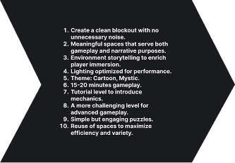
Pre-production stage: The team was tasked with creating 3 prototypes of different ideas in 2 weeks.
My task was to design levels for these prototypes.
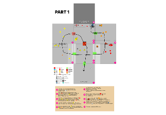
RING PROTOTYPE
The main idea of the game is that you must die at the hands of an enemy in order to take their body and their ability.
First level prototype: Designed to showcase all the enemy abilities and teach the player about different types of enemies and basic puzzles.
In the blue zone, you gain the jump ability, which allows you to jump back to the starting zone and then to the green enemy.
With the help of the green enemy, you can use dash to break a wall and reach the red enemy.
Using the red enemy, you can shoot at a target and activate a platform, allowing you to progress further.

RING COMBAT PROTOTYPE
Ring Combat Game is similar to the previous game, but now the player must kill enemies. The player can also store all abilities at once. The enemies are the same, but now there are bosses, and defeating them grants the player new abilities.
The main idea was to create a backstory for each enemy.
Each enemy has its own zone, and at the end of the zone, there is a boss.
Defeating a boss grants the player a new ability.
The prototype fits well with a narrative story: clear a zone, get a new ability, and access the next zone.
To avoid backtracking, a teleporter was added to return the player to the starting zone at the end of the level.

STEALTH GAME PROTOTYPE
The main idea of this prototype is that you can paint enemies and the environment in different colors. If you paint an enemy in your color, they become your ally and attack other enemies. If you paint an area in your color, you can hide there. You can throw paint or set paint traps. I had the least amount of time for this prototype.
The main idea was to create a backstory for each enemy.
Each enemy has its own zone, and at the end of the zone, there is a boss.
Defeating a boss grants the player a new ability.
The prototype fits well with a narrative story: clear a zone, get a new ability, and access the next zone.
To avoid backtracking, a teleporter was added to return the player to the starting zone at the end of the level.

LEVEL DESIGN PROCESS

RESEARCH
I started with research, studying top-down games and identifying key aspects.
GOALS
I defined key goals for my level, including the theme and gameplay duration.
2D LAYOUT
Then, I created several iterations of the top-down map to present the design to the team. I also developed Level Beats.
GRAYBOX
I created the first version of the greybox in Unreal Engine 5 for playtesting. I also placed some puzzles and enemies.
ITERATE
Implemented assets, VFX, and lighting. Conducted playtests and went through multiple iterations.
RESEARCH
Before starting the project, I conducted research to understand how levels and puzzles are structured in top-down games and to adapt some ideas. As a result, I identified several key elements that I applied to my level design:
Environmental exploration – players return to familiar areas, unlocking new territories.
Distinctive areas – each location has a unique atmosphere and is easy to remember.
Wall-hiding shader – improves visibility by removing walls when the player is inside.
Seamless UI integration – the interface is embedded in the tutorial without breaking immersion.
These elements helped make the levels intuitive and engaging.
GOALS

Open

Then, I defined the goals I wanted to achieve while designing this level.
SKETCHING
At the beginning of the project, I started working on a 2D map. The team's concept included two levels.
The first level was designed to introduce players to all enemy types.
The second level was planned to feature more complex puzzles and a boss fight.
The team liked the first iteration of the map.
The team requested more activities and puzzles in the rooms.
In the second iteration, I made the rooms more complex to meet these requirements.
TOP DOWN
LEVEL BEATS
PUZZLE SKETCHING
Puzzles were a key part of the game.
I collaborated closely with game designers to create and implement them.
The main concept was to base puzzles on enemy abilities, unlocking new areas and progression when players possessed new enemies.
Some puzzles were designed to be visible but only accessible upon revisiting, making backtracking satisfying and rewarding.

Open


Open

METRICS
I used the standard Unreal Engine Starter Architecture Pack for blockout metrics. The artist later created assets based on these metrics. All movement and controller mechanics were designed to align with these metrics.Dimensions:
Walls: 4x4 meters
Doorway width: 1.24 meters
Walls: 2x4 meters
Walls: 4x2 meters

Open

DESIGN INSIGHT
CHALLENGE 1: TECHNICAL SIDE
EXAMPLE 1
CAMERA ANGLES
Camera Angles
The first problem I faced was related to camera angles. During level prototyping, the levels were designed with one fixed camera. However, the team later decided to adjust the camera system, which required reworking certain rooms.
Page 1: The problem was that button [1] opened door [2], but the door was not visible when the button was pressed. Players were confused about what happened upon interaction.
Page 2: This shows how it looked in the game at that stage [3].
Page 3: I resolved the issue by redesigning the level. Button [4] now opens door [5], and I added visual feedback with a blue flame when the door opens. Target [6] activates platform [7]. However, a new problem arose.
Page 4: The target [8] was not visible because the camera followed the player, obscuring critical information.
Page 5: To address this, I redesigned the level again. Target [9] activates platform [10], button [11] opens door [12], and target [13] activates platform [14], allowing players to see immediate feedback for each interaction.
This iterative process ensured the gameplay became clearer and more intuitive with proper visual feedback and better camera design.
EXAMPLE 2
SOFTLOCK
Avoiding Softlock
This project was my first experience dealing with the issue of softlock, and throughout the development, I learned how to address and resolve these problems.
Page 1: The problem was with an obstacle that only the dash enemy [1] could pass through. If the player died and remained in ghost form, they would have to restart the entire level to progress. Since the level was large, this became frustrating.
Page 2: I removed the obstacle and redesigned the area, making it diagonal. This added variety to room layouts (previously all rooms were square) and made the black grate [2], through which players can pick up a body, more visible. Players needed to learn this mechanic here for future progression.
Page 3: During playtests, we found a new issue: if the player entered ghost form before the grate and picked up the body behind it [3], they could not leave the area. They couldn’t even die to restart the level and had to begin the game from the start.
Page 4: To fix this, I added a ghost wall [4] (a wall that only ghosts can pass through) and a staircase leading to it. This allowed players to learn the mechanic of picking up a body through the grate (important for Level 2) and safely exit the area via the ghost wall, avoiding softlock.
This iterative process resolved the softlock issue and ensured that key tutorial mechanics were effectively taught to the player.
CHALLENGE 2: TUTORIAL/BACKTRACKING
EXAMPLE 1
TUTORIAL
Designing the Tutorial
Another challenge was creating an effective tutorial for the player. With many mechanics to teach, it was essential to introduce them gradually. To achieve this, I used the Teach => Test => Twist methodology. Here’s an example of how I implemented this with the body possession mechanic:
1. TEACH
Goal: Teach the basic mechanic — body possession.
Scenario: A stationary body in a safe zone.
Conditions: No threats, with a visible hint.
Outcome: The player learns the mechanic and understands its purpose.
2. TEST
Goal: Show the player they can take over an enemy's body.
Scenario: An enemy must be defeated to possess its body and progress further.
Conditions: Minimal hints, the enemy moves or attacks.
Outcome: The player eliminates the enemy, takes its body, and progresses.
3. TWIST
Goal: Add complexity to the mechanic with new conditions.
Scenario: An enemy's body is behind an obstacle; possession must occur through the obstacle.
Conditions: The player needs to approach the obstacle closely to take the body.
Outcome: The player possesses the body through the obstacle and solves a more challenging puzzle.
EXAMPLE 2
BACKTRACKING
Backtracking
Another challenge was backtracking. Initially, the plan was to create small levels with a minimal number of rooms, as we were limited in assets and aimed to keep the game small in scale. As a result, my level design focused on reusing spaces effectively.
The first time the player enters a room, they see a zone they cannot access.
When returning a second time, now equipped with new abilities, the player can utilize that zone.
I decided to use backtracking as an advantage, allowing the player to unlock areas that were previously inaccessible.
CHALLENGE 3: ART PASS
EXAMPLE 1
VISUAL FEEDBACK
Visual Feedback
The first issue we encountered during playtests was that players couldn’t see which objects they were activating. To address this, I decided to make the visual feedback as clear as possible while ensuring it matched the overall style of the game.
I added fire VFX to all objects that could be activated.
I adjusted the VFX color to match the ghost's color and implemented color changes for the VFX using Blueprints.
After these changes, the player can instantly see which button activates which object.
EXAMPLE 2
MARKERS
To enhance clarity, I used assets to create markers:
Moving Platforms:
I added a yellow material to the carpet on platforms that players can jump onto.
Wooden planks were added to the side where players can jump onto the platform.
Disappearing Floors:
I used enlarged wooden planks to visually communicate the "instability" of the structure.
Our programmer added a wobbling effect to the floor when the player steps on it, along with a creaking sound.
Shootable Puzzle Targets:
I created a target mesh directly in Unreal Engine to clearly indicate where players need to shoot.
EXAMPLE 3
SET DRESSING
On this project, I was responsible for set dressing, and since there were two levels, I developed a small backstory to differentiate them. I designed two distinct territories for each level:
Level 1: The Palace:
The player begins outside and then enters a palace, giving them a clear sense of location and progression.
The palace features warm colors, with an abundance of carpets and a cozy, inviting atmosphere.
Each room has its own function and visual story, making the palace feel alive and purposeful.
Level 2: The Dungeon
The underground floor represents a dungeon, visually distinct from the palace.
The level is lit with green hues to emphasize the separation between the palace and the dungeon.
The design focuses on stone materials to evoke a colder, harsher environment.
"Poison rooms" were added to create a dangerous and unwelcoming space.
Similar to the palace, each room in the dungeon is visually distinct, with its own function and visual story.
The color separation between levels helped me distinguish the environments and create a sense of progression for the player, as they unlock a new territory after completing the first level. Additionally, this separation allowed me to reuse assets, which was crucial for this project due to the team's limited asset resources.
ITERATIONS
There were six iterations of the blockout:
First Iteration: Created the initial blockout.
Second Iteration: Added player placements and puzzles.
Third Iteration: After the first playtests, I refined and enhanced the spaces in various rooms.
Fourth Iteration: Began adding assets to the blockout.
Fifth Iteration: Completed set dressing, added lighting, and improved the layouts of some rooms.
Sixth Iteration: Following additional playtests, I made changes to avoid soft locks, improved object placement for the top-down camera, and added more assets and VFX to enhance readability and feedback.
REFLECTION
This was an incredible project where I learned a lot. I went through the entire development pipeline, from prototype to final product.I spent a significant amount of time working on the 2D map, going through multiple iterations until the producer gave me the green light. This made it much easier to build the blockout and place puzzles and enemies efficiently. Of course, additional iterations were necessary to avoid soft locks, adjust camera angles for objectives, and fix smaller issues, but these challenges helped me improve my design skills.I’m also glad I got the chance to work on set dressing. Due to asset limitations, I had to creatively repurpose existing assets to build new ones. This was challenging, but it taught me a valuable new skill that I hadn’t considered before.Designing the tutorial was another complex task. In hindsight, I might approach it differently next time. I would consider making the player fully master puzzles for one enemy before introducing the next. This structured progression could have worked better in this situation.Regardless, I truly loved this project, and I’m grateful to my team for their hard work, constant support, and feedback throughout development.

outside iterations


Storage iterations


Entrance Iterations


cells iterations


dining room iterations


library Iterations


Corridors Iterations

LEVEL DESIGN PROJECTS:


Counter-Strike 2

Far Cry 5

PROTOTYPES:

Last Sunset

![Chernobyl]()
Chernobyl


Crypt Of Fear


THINGS THAT I DID

LEVEL DESIGN:
I was responsible for the entire level design of the map. I created the layout plan, defined metrics, built the greybox, and balanced the map.

Environmental Storytelling:
I tried to convey narrative through level design—a desert, skyscrapers, and a post-apocalyptic setting.

BLUEPRINTS:
Using Blueprints, I created simple scripts for interactions and a mission list.

lighting:
I also handled all the lighting. It was important not only for guiding the player but also for setting the mood.
CONTENTS
ABOUT LAST SUNSET:
DESIGN INSIGHT:
ABOUT LAST SUNSET
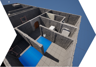
LAST SUNSET is a mission-based level set in a post-apocalyptic world.
Player Objectives:1. Infiltrate the skyscraper
2. Find the key
3. Eliminate the boss
4. EscapeThe mission can be completed through stealth or direct combat, offering multiple gameplay approaches.
TOP DOWN

Open


Open

MAIN GOAL

Open

The initial goal was to create an FPS level with five minutes of gameplay, allowing for stealth mechanics. I knew that designing a stealth level would be a major challenge, but I felt it was important to start somewhere, make early mistakes, and learn how it works.Additionally, I wanted to convey a post-apocalyptic atmosphere through environmental storytelling. I was inspired by Blade Runner 2049 and was eager to recreate that immersive atmosphere.
LEVEL FLOW
1. The player starts on the rooftop of a neighboring skyscraper, with a clear view of the level.2. The player spots the first enemy and chooses between engaging in combat or sneaking behind for a stealth kill.3. In the next room, the player sees their final objective—the boss's door, but it's currently locked.4. The player enters the warehouse and gains a vantage point over two enemies.5. On the other side, another enemy and a keycard can be seen.6. Upon descending to the bridge, the player encounters more enemies and can choose to use explosive barrels to eliminate them, shifting from stealth to all-out action.7. After collecting the keycard, the player can unlock the previously inaccessible door to the boss.8. The player engages the boss in combat.9. After eliminating the boss, the player escapes via the helipad.
LEVEL DESIGN PROCESS
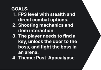
GOALS
At the beginning, I set several goals to guide me in the level design process.
2D LAYOUT
Then, I drew a map in Figma with brief descriptions of rooms, objects, and enemies.
GRAYBOX
I created the first iteration of the greybox in Unreal Engine 5, placed enemies, and developed several Blueprints.
ITERATE
First playtests and tweaking. Implemented some 3D assets and lighting.
RESEARCH
REFERENCES
After analyzing several popular games that feature stealth mechanics, I identified a few key elements:
Verticality – Essential for better visibility and strategic positioning.
Alternative routes – Allows players to choose their own playstyle and approach.
Cover – Utilizing corners, furniture, and environmental objects for stealth movement.
METRICS

OPEN

BLUEPRINTS

OPEN


OPEN


OPEN

DESIGN INSIGHT
CHALLENGE 1: LIGHTING
EXAMPLE 1
GUIDES THE PLAYER
Lighting as a Guide for the Player1. First Image: The light highlights the door, directing the player towards the correct entrance.2. Second Image: The light hits the wall, allowing the player to see its source and naturally guiding them in the right direction.3. Third Image: A large red screen serves as a landmark, clearly indicating the player’s final objective.
EXAMPLE 2
TELLS THE PLAYER

open

I also used lighting to emphasize key moments for the player. For example, this entire composition visually communicates that this is it—the final moment. It signals that the most important part of the level is about to begin.
CHALLENGE 2: COMBAT
EXAMPLE 1
DIRECT COMBAT
For direct combat, I designed the environment to encourage the strategic use of both cover and angles.As a reward for engaging in direct combat, I added Explosive Barrels. If the player was sneaking before, they can simply shoot the barrels to deal massive damage to nearby enemies. This is especially useful for taking down larger enemies, giving the player a tactical advantage.
EXAMPLE 2
STEALTH
Designing Stealth Encounters: Methods and Iterations1. Alternative Paths. First Image:
The player has two possible routes
Green Path – A stealth route, allowing the player to sneak through the area.
Blue Path – A direct combat. It’s riskier, with a higher chance of detection.
2. Cover Usage. Second Image:
Cover placement is designed to shield the player while they take out an enemy, ensuring they remain hidden from other enemies.
3. Importance of Overview in Stealth Mechanics.
Fourth Image (Before Feedback) – The player started from below, making it difficult to see enemies and plan a stealth route, making the encounter unnecessarily difficult.
Fifth Image (After Feedback) – The player now starts from an elevated position, providing an immediate overview.
As the player progresses, they can gradually spot more enemies, improving strategic planning for stealth.
These images demonstrate the difference between a limited overview and an optimized stealth design.
CHALLENGE 3: ENVIRONMENT STORYTELLING
EXAMPLE 1
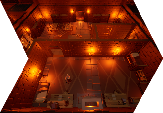
Post-apocalypse
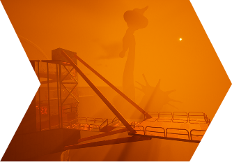
Conveying the Post-Apocalyptic Atmosphere Through Environment Storytelling1. First Image: The skyscraper is tilted to the left, suggesting structural collapse and decay.2. Second Image: Various objects have also fallen in the same direction, reinforcing the sense of destruction. Additionally, the building has a broken wall, further emphasizing the ruined state of the world.3. Third Image: The Statue of Liberty is shrouded in orange fog, symbolizing the dystopian, post-apocalyptic setting.4. Fourth Image: I experimented with architecture to make the boss room feel unique—hence the rounded roof. I also incorporated large glass surfaces so that the player frequently sees the orange fog, further immersing them in the post-apocalyptic atmosphere.
EXAMPLE 2
bad place
I also used environmental storytelling to convey the atmosphere that bad people inhabit this place and that something sinister is happening here.1. To reinforce the atmosphere of a sinister place, I created a composition using an Unreal Engine character, a metal box, and red lighting. This setup evokes a sense of eeriness, suggesting that experiments or something unsettling may have taken place here.2. I also added cages to the warehouse area to reinforce the idea that this place is connected to something sinister. Cages, no matter where they are, are meant for confinement. A place where people or animals are locked up automatically feels unsettling and menacing.3. I also used a lot of red lighting throughout the environment. Red light in deserted areas or crowded spaces naturally creates a sense of anxiety and unease, reinforcing the tense atmosphere.
ITERATIONS
REFLECTION
This project was a valuable experience and helped me improve my level design skills. Through this project, I learned that:1. For a stealth level, it's crucial to provide a good overview of the environment and enemies—or at least give the player a chance to survey the level at the beginning, preferably from an elevated position.2. Alternative routes are essential in a stealth level to allow for varied approaches to solving challenges. I implemented multiple routes in this level, but I believe they could have been improved. Next time, I will focus more on refining this aspect.3. Playtesting is invaluable. It helped me identify and fix problematic areas, reinforcing the importance of iterative design.


THINGS THAT I DID

LEVEL DESIGN:
I was responsible for the entire level design of the map. I created the layout plan, defined metrics, built the greybox, and balanced the map.

Environmental Design:
I developed the visual style from scratch. I also found a way to reuse existing assets and textures to create a new, visually unique map.

TECHNICAL PART
An important part of the work was also setting up events, animations, and enemies. Moreover, it was crucial to manage the engine budget, as Far Cry Arcade has limitations on AI, assets, lighting, and VFX.

lighting:
It was important for me to create lighting that matches Far Cry 5's style while also guiding the player and maintaining a realistic feel.
CONTENTS
ABOUT FAR CRY 5 LEVEL:
DESIGN INSIGHT:
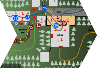
FAR CRY 5. LEVEL DESIGN
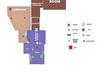
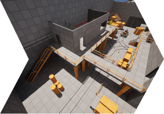
OVERVIEW
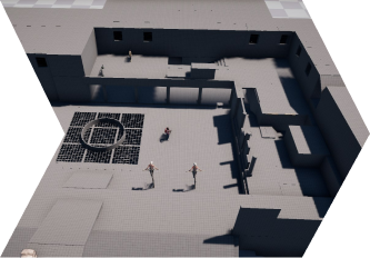
The level starts outside a rural church, where the player is unarmed and vulnerable
Inside the seemingly peaceful church, they find a hidden passage leading to an underground jail, where they are briefly trapped.
In the dim tunnels, the player takes down guards and scavenges weapons, slowly regaining strength.
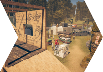
Escaping the jail, they emerge into a large enemy camp, offering multiple tactical options—stealth, sniping, setting traps, or all-out assault.
After battling through the camp, the player fights their way back toward the church, now fully armed and in control.
This progression from surviving to hunting creates a strong contrast between the tense opening and the open-ended combat in the camp.
LEVEL DESIGN PROCESS

RESEARCH
I started by studying the mechanics, narrative, and level design in Far Cry 5.
TOP DOWN
I created three top-down maps and selected the one that best fit my goals.
BLOCKOUT
I created the first blockout to establish the core architecture of the map and define its metrics.
ITERATE
I went through iterations, worked on enemy placement, set dressing, and lighting.
RESEARCH
Part of the assignment was to analyze the game to understand how, on what, and for what purpose the level is built. I analyzed Far Cry 5 and identified:
Genre
Target Audience
Pillars
Core Mechanics
AI Behavior
Narrative
Level Design
GOALS
This level was part of our Advanced Level Design course, where Peter Vesti Frendrup (Studio Level Design Director at DICE) assigned us a task designed to closely resemble what a real Level Designer would face in the industry. He provided me with goals that I needed to achieve while building the level.

TOP DOWN
During the process of creating the top-down map, the assignment required making three different paper prototypes. Part of the task was to apply design rationale, explaining why a particular design would be the best choice for my level.
TOP DOWN
LEVEL BEATS & LEGEND
WHY?
First and foremost, I chose this design because it allows me to achieve all the set goals. Secondly, I like that this design enabled me to incorporate several interesting design aspects:
1. I decided that a prison is a perfect fit for the linear section because Far Cry 5 is an open-world game, and a closed environment works best for a structured, linear sequence.2. In the open area, the player should have several options, but not too many.
I determined that three possible paths would be sufficient.
These three different paths offer different types of weapons (explained in more detail later).3. This design perfectly showcases the progression from surviving to hunting as the player returns to the church at the end of the level after eliminating all enemies.4. Weapon and enemy progression further reinforce this effect, making the player's journey feel impactful.
TENSION GRAPH

Open

My level features five encounters:
Stealth/Combat encounter
Shotgun encounter
Rifle encounter
Sniper encounter
Machine Gun encounter
This graph shows that each encounter reaches its peak tension in the middle and then declines at the end. Why?
Because the most intense combat happens at the midpoint of the encounter.
At the end of the encounter, the player finds a new weapon in a safe zone, allowing them to take a brief break. The exception is the Machine Gun encounter (8).
This is because, at this moment, the battle is at its peak.
The final tension spike (9) occurs until the player eliminates all enemies and leaves the area (10).
BLOCKOUT
Then, I started working on the blockout. At this stage, I defined:
Core metrics
Key Spaces
Approximate enemy placement and progression
Approximate weapon placement and progression
First playtest and gathered feedback
ITERATIONS
After that, there were many iterations, which included:
AI setup
Created the graybox
More playtests
More feedback
More iterations
Set dressing
Lighting
DESIGN INSIGHT
Before starting work, I identified three key design aspects that would help me achieve the level's goals:


SPACES
At the beginning, the space should be linear and tense, and then large with many tactical decisions. I also tried to make the space support player progression through the level (for example, different spaces for different weapon types). I also tried to make the space unique while still fitting into the narrative and style of Far Cry 5.
PROGRESSION
Progression should help achieve the goal of "from surviving to hunting." I tried to do this through the distribution of different weapon types and different enemy types, as well as trigger events that enhance the satisfaction of using weapons while maintaining immersion and creating a challenge for the player.
ENCOUNTERS
Encounters should reflect this contrast and enhance the key elements of tension, progression, and playstyle choice.Stealth
Main goal: Create a tense atmosphere, making the player feel vulnerable and resource-limited.High-Intensity Combat/Sniping Opportunity
Main goal: Give the player a sense of choice and progression—they are no longer the prey but the hunter, deciding how to clear the camp.
CHALLENGE 1: SPACES
EXAMPLE 1. TACTICAL SPACES
How Level Geometry Enhances Weapon Usage
One of my goals was: At the beginning, the space should be linear and tense, and then large with many tactical decisions. I followed this goal while also trying to create a level geometry that helps the player maximize the effectiveness of their weapon at a given moment.1. PLAYER VIEW: The player starts unarmed, and the space is tight, but at the same time, they have a clear view of nearby enemies, allowing them to plan their actions.2. NARROW CORRIDORS: Then, before entering the narrow corridors, the player finds a shotgun. The shotgun is perfect for tight and enclosed spaces, as it allows the player to eliminate enemies up close with a single shot.3. OPEN AREA: As the player moves into a more open battlefield, they gain access to a rifle, which is ideal for mid-range combat. While long-range engagements are possible, they are more challenging due to cover placements and enemy positioning.4. SNIPER TOWER: When, the player acquires a sniper rifle, benefiting from height advantage and strong defensive positioning. Elevated sightlines make this the optimal space for precision shooting, reinforcing the power of long-range engagements.5. MACHINE GUN: Finally, the player gains access to a static machine gun, positioned on a rooftop at a lower elevation, directly overlooking the road where enemies will arrive. This placement allows for effective suppression of both ground vehicles and airborne threats, giving the player a sense of dominance and power in the final phase of the battle.
Why?
The main reason behind this design approach was to reinforce weapon progression through spatial design. Instead of simply handing the player new weapons, I wanted each transition to naturally introduce a new playstyle by aligning the environment with the weapon’s strengths.
A closed and tight space with good visibility is perfect for an unarmed stealth encounter.
Tight spaces favor shotguns, making them feel powerful in close combat.
Mid-range areas encourage the use of rifles, offering flexibility between aggressive pushes and controlled engagements.
High-ground vantage points maximize sniper effectiveness, rewarding precision and patience.
The final section, with a mounted machine gun, provides a sense of power, allowing the player to dominate both infantry and vehicles.

Open


Open

EXAMPLE 2. NARRATIVE SPACES
Far Cry 5 is a game about the Project at Eden’s Gate cult, which has taken control over the fictional Hope County in Montana. Because of this, I decided that my level should include:
Church in my level that belongs to the cult.
I wanted to create a vertical level with an underground section, ideal for the linear part of the mission. I was also inspired by the underground prison from True Detective Season 1, as it depicted a somewhat similar cult. This led me to the idea of creating an underground prison, which fits perfectly into the environment.
For the backyard, I designed a classic cult camp with cover spots, buildings, and garages to support different gameplay scenarios.
Why?
The cultist church immediately signals to the player that this is their territory.
The underground jail reinforces the idea that cultists hold prisoners there, likely brainwashing them.
Cultist camp helps convey the cult’s atmosphere while also showing that it is a heavily armed and fortified area.
EXAMPLE 3. NAVIGATION & SIGHTLINES
It was also important for me to ensure that the level was intuitive. To achieve this, I guided the player using lighting and enemy placement, while also providing clear view angles at each phase of progression.1. PLAYER START:
Smoke indicates where the main battle will take place and helps the player understand that they are not alone.
The church is the player's destination, so the level starts with a clear view of it.
2. CHURCH:
The player sees enemies, signaling that the path is blocked.
The red light draws the player's attention, indicating that there is a passage.
3. CAVE:
The player can see the exit, once again marked by red light, which naturally draws their attention.
The player has a clear view of the enemies before the stealth encounter begins.
4. OPEN AREA:
The rifle encounter comes first, and the player has a clear view of their next objective (sniper tower).
The player has overview of the platform, while also having enough cover to move safely.
The player sees the fire, with smoke matching what they saw at the beginning, signaling the start of the mission's main phase.
5. SNIPER TOWER:
The player has a clear view of the next objective (machine gun) and the zipline that leads to the next building.
The player also has a direct line of sight to the final objective (evacuation point).
CHALLENGE 2: PROGRESSION
EXAMPLE 1. WEAPON PROGRESSION
The weapon progression on my level is as follows:Unarmed → Shotgun → Rifle → Sniper Rifle → Machine Gun
Why?
One of the goals was: To achieve the goal of "from surviving to hunting," the player must start weak and become very powerful by the end.My approach was to create a progression that helps me achieve this goal.
The player starts unarmed, meaning they cannot engage in direct combat. Their only option is to use stealth.
Then, the player finds a shotgun, which is well-suited for tight underground spaces but is almost useless in open areas. For this reason, I skipped the pistol in the weapon progression. The pistol works well at both distances, but it loses to the shotgun in close combat, making it a less distinct choice for this level.
Next comes the rifle, which is effective in both close and long-range combat, as well as against groups of enemies. The only weapon that outperforms the rifle is the sniper rifle.
The sniper rifle, which eliminates enemies with a single shot, is one of the most powerful weapons in the game. I also provide the player with a strong vantage point, allowing them to safely engage enemies from a distance.
The final weapon in the progression is the Static Machine Gun, which cannot be added to the player's inventory, but its firepower and positioning make it highly effective against enemy vehicles and the attacking helicopter.
EXAMPLE 2. ENEMY PROGRESSION
Goal
Utilize how loot is distributed through enemy archetypes as well as world placement—this creates a unique opportunity to shape the player experience.To achieve this goal, I used a variety of enemy archetypes.Melee enemies (bat-wielding opponents) ➝ Shotgun enemies ➝ Flamethrower enemy ➝ Rifle enemies ➝ Heavy enemy ➝ VIP enemy (high-priority target) ➝ Enemy waves (helicopter and vehicles).I analyzed the enemy types in Far Cry 5 to create a gradual difficulty progression. Basic scenario was:Player encounters a new enemy type ➝ Old weapon is ineffective, making the fight challenging ➝ Player finds and uses a newly acquired weapon ➝ Player defeats the enemy and progresses further.
Why?
Ensures Natural Progression – Each enemy phase aligns with a weapon upgrade, making the difficulty curve feel organic.
Encourages Tactical Adaptation – The player must adjust combat strategies as new enemies and weapons are introduced.
Reinforces Level Flow & Combat Pacing – By controlling when weapons are given, the level maintains a sense of buildup and payoff.
Creates a Satisfying Power Curve – The player starts vulnerable but progressively becomes stronger, making combat feel rewarding.
CHALLENGE 3: ENCOUNTERS
EXAMPLE 1. STEALTH
Designing the stealth encounter went through multiple iterations and changes. The main issue at first was that the challenge was too low—initially, I placed all enemies facing away from the player, making it too easy to eliminate them.To improve the encounter, I introduced small challenges, making the stealth sequence more engaging.
1. The first enemy is easy to eliminate because they cannot see the player.
WHY: It's important to start the encounter with an easy kill to let the player get comfortable with the mechanics.2. The second enemy faces the player, but there is a crouch passage in the wall that allows the player to sneak behind and take them down.
WHY: This introduces a small challenge—the player must move quickly and at the right angle. It also teaches the player that alternative paths exist in this level.3. This area has three enemies.
The first enemy stands with their back turned, but after killing them, the player must hide the body, or two other guards will spot it.
After hiding the body, the player finds a shotgun and a passage in the wall.
WHY: This introduces a new mechanic (body dragging), adding another layer of challenge and variety to gameplay.4. The last two enemies are visible from a distance, allowing the player to mark them.
- The player can sneak past through a prison cell passage, distract them with a stone throw, and take them down with a combo attack.
WHY: The difficulty gradually increases, adding more enemies and encouraging strategic play. This also introduces two new mechanics (distraction throw & combo attack), further diversifying gameplay.Final Result
The stealth encounter now presents an engaging but fair challenge, allowing the player to use different mechanics and experiment with multiple playstyles. This makes the gameplay more varied and exciting.
EXAMPLE 2. SNIPER
For the sniper encounter, I focused on:
High vantage point (tower).
Long, open sightlines for sniping.
Cover spots for protection after taking a shot.
Enemies moving at medium and long distances to create varied engagement.
Why This Works?
Encourages player agency – The encounter allows the player to choose when and how to engage.
Balances risk and reward – The high-ground advantage is powerful, but enemies still pose a threat, preventing a one-sided fight.
Supports weapon progression – The encounter naturally fits into a level where the player has recently acquired a sniper rifle, reinforcing its tactical purpose.
Maintains combat pacing – The player can take time to analyze the situation, but cannot stay too long in one place without consequences.

High Vantage Point (Tower)
The elevated position provides a clear tactical advantage, allowing the player to control the battlefield and pick off enemies before engaging in close combat.
Encourages scouting and target prioritization, as the player can assess enemy positions before taking action.
Prevents enemies from overwhelming the player immediately, giving time for strategic play.
Long, Open Sightlines
Enables effective use of sniper rifles, ensuring that the weapon’s strengths are fully utilized.
Provides a sense of dominance and control over the battlefield.
Encourages careful positioning and precision shooting rather than run-and-gun tactics.
Cover for Post-Shot Protection
After taking a shot, the player needs nearby cover to break line of sight and avoid counterfire.
Encourages a shoot-and-move playstyle rather than static camping, keeping the encounter dynamic.
Cover placement should balance risk and reward, allowing the player to peek, reposition, and engage strategically.
Enemies Positioned at Mid to Long Range
Mid-range enemies provide a fallback challenge if the player chooses to engage at a closer distance.
Long-range enemies add pressure and urgency, requiring the player to act before getting overwhelmed.
Potential counter-snipers force the player to adapt, keeping the encounter from becoming one-sided.
EXAMPLE 3. HIGH-INTENSITY
I also designed two high-intensity encounters:1. Fast-paced action – The player is in a tight, enclosed space, and enemies know their location. The player must move quickly to escape the trap.
Why does it work?
Prevents static, repetitive gameplay – Forces players to think on the go instead of just hiding behind cover.
Encourages awareness and movement – Players who constantly reposition gain a tactical advantage, as enemies struggle to react in time.
2. Escalation – The player faces waves of enemies, reinforcements, and changing enemy types, increasing the intensity of the battle.
Why does it work?
Creates a satisfying power moment – The player feels dominant but must still manage threats strategically.
Prevents static, repetitive gameplay – The variety of enemy types forces the player to prioritize targets and adapt tactics.
Increases pacing and escalation This encounter serves as a high-intensity peak before the mission's final moments.
Enhances environmental interaction – The battle feels chaotic and cinematic, with destruction, explosions, and enemy movement shaping the flow of combat.
CHALLENGE 4: ART PASS
EXAMPLE 1. REUSING ASSETS
I mainly used Far Cry 5 assets, which are part of the official game, but I also incorporated engine assets to create unique objects.For example, by combining two rock pieces, I was able to construct an entire underground prison, covering the gaps with larger rock formations of the same type.
Why does it work?
This allowed me to create my own unique architecture.
This enabled me to develop a distinct visual style.
This helps differentiate the level from others in the game conceptually.
EXAMPLE 2. DECALS/VEGETATION
Since I had asset limitations and couldn't resize textures, I faced the challenge of some areas looking too repetitive, making them feel unrealistic. To address this, I used additional assets, decals, and vegetation.
Why does it work?
Decals, additional assets, and vegetation help maintain visual variety and realism without needing excessive unique assets.
This approach effectively hides repetition, making the environment feel more natural.
It adds narrative depth, reinforcing the storytelling within the level.
It enhances player immersion, ensuring the world feels organic and believable.
The level remains optimized, balancing visual quality and performance.
REFLECTION
Overall, I’m happy with what I was able to achieve in four weeks. The analysis and research phase was especially helpful, as it allowed me to understand the game better, considering I had never played Far Cry 5 before this course. It was a challenging process, but I successfully met all the design goals set at the beginning of the project. The iterations I made after feedback sessions significantly improved the level.
What Went Well:
Analysis and research helped me understand mechanics, narrative, and level design in Far Cry 5.
Iterative process after feedback sessions greatly improved the level.
Quick adaptation to a new editor—this was my first time using Far Cry Arcade.
Full development process from paper prototype to set dressing and publishing in Far Cry Arcade.
What Can Be Improved:
Shotgun and rifle encounters could be improved by giving the player more space to utilize these weapons effectively.
Add a narrative transition at the start of the mission so the player understands how they ended up unarmed in this situation.
Rewarding playstyle variety—currently, the sniper tower route is the most engaging option. If I have time, I would like to make ground-level gameplay just as interesting.
THINGS THAT I DID

LEVEL DESIGN:
I was responsible for the entire level design of the map. I created the layout plan, defined metrics, built the greybox, and balanced the map.

Environmental Design:
I developed the visual style from scratch. I also found a way to reuse existing assets and textures to create a new, visually unique map.

TECHNICAL PART
An important part of my work was lighting and its impact on performance. I also worked with VIS optimization and was responsible for script placement.

Marketing:
I also created the logo, trailer, and level screenshots, as well as designed the Steam Workshop page for the map.
CONTENTS
ABOUT DE_ARCTIC:
DESIGN INSIGHT:
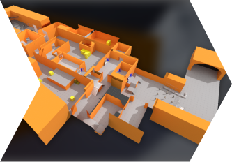
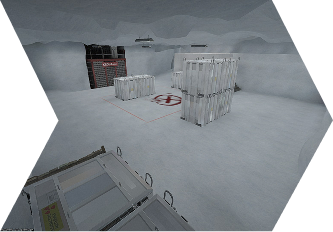
ABOUT DE_ARCTIC
OVERVIEW
de_arctic is a classic 5 vs 5 map, featuring two buy zones (one on the CT side and one on the T side), two spawns (T side and CT side), and two bomb sites (A and B). The map also includes the traditional three-lane structure: a path to A site, a path to B site, and the Middle lane.The map also incorporates verticality:
1. Point B is located on the ground floor.
2. Point A is located on the -1 floor.
PLAYTHROUGH
WORKSHOP STATS

Open

TOP DOWN

Open

The map turned out to be fairly compact, allowing for quick rotations. As in any classic competitive map, CTs spawn closer to A and B plants, as they play defensively, while T-side starts further away, since they are on the attacking side.I also decided to name certain areas, as this is crucial for competitive gameplay and effective team communication.
LEVEL DESIGN PROCESS
RESEARCH
I started by studying the best maps according to the community and pro players. I tried to understand what makes them better.
GOALS
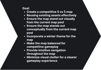
Then, I set specific goals to focus on during the creation of this level.
RAPID PROTOTYPING
I decided to skip paper design and create a quick prototype in Unreal Engine 5 for several reasons:1. This is a solo project.
2. It saved me a lot of time since I could quickly test multiple blockout variations and determine the level geometry I wanted.
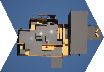
BLOCKOUT
I created the first blockout in Hammer. I placed team spawns and scripts for playtesting.
ITERATE
I did set dressing and modified some areas after the first playtests. I also updated the map on Steam Workshop for further feedback.
RESEARCH
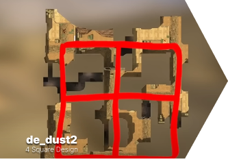
1. I analyzed the CS2 community, read through comments, and found that the most beloved maps are: de_dust2 and de_nuke.- de_dust2 is the most popular and also the most controversial map. The community loves it because it’s a classic. It became a classic due to its simplicity. This map is a great example of the "4-square design" (more about this here: link at 7:00). However, many players disliked it because of the middle doors, which gave the T-side an advantage at the start of the game. However, it seems that after recent changes, the map has improved.- de_nuke doesn’t follow the 4-square map design. On the contrary, it stands out as quite unique in terms of layout. This map is great because it offers both open and closed areas. Additionally, it features interesting verticality, allowing for quick rotations for both teams. Players love this map for its balance, compactness, and simplicity.2. I also discovered that the best maps, according to the community and pro players’ tier lists, are:
de_nuke and de_overpass.- de_overpass is also a unique map when you consider its layout. Rotation between bomb sites happens quite quickly, and the map includes open and closed spaces. It also features excellent verticality and balance, making it highly appreciated by players.
MAIN GOAL
My main task was to create a competitive 5 vs 5 map that would stand out visually and conceptually from the current map pool. Another key objective was to design a visually distinct map using existing assets. After analyzing the available map pool in CS2, I realized that there has never been a winter-themed competitive map. I wanted the map to stand out not only in its visual style but also to be balanced and offer intuitive navigation. Additionally, it was important for me to minimize visual clutter for a clearer gameplay experience.

PROTOTYPING
This time, I decided to skip the paper prototype stage because I had a rough idea of how my map would look. I knew it would have a classic structure (A and B plant and mid lane), but I wasn’t sure about the exact layout. So, I decided to create a quick prototyping in Unreal Engine 5 within 1-2 days, which gave me a clear picture of the level.This was the first iteration of my blockout in Unreal Engine 5. My main goal was to determine approximate metrics, dimensions, and define the key spaces for the map. I chose to create this prototype in Unreal instead of making a paper prototype.It took me 1-2 days to complete. The prototype turned out to be quite rough, but since I was working alone, it served its purpose—helping me visualize how I imagined the map.
REFERENCES
PROTOTYPE
BLOCKOUT

Open

Then I created the blockout and also implemented:
Basic lighting
Spawn points for T and CT, along with Buy Zones
Two bomb sites: A and B
Basic cover placements
ITERATIONS
At the moment, the map has gone through four iterations:
First Iteration: Created in Unreal Engine, where I experimented with approximate scale and architecture.
Second Iteration: Moved to Hammer Engine, keeping most of the layout the same but adjusting a few areas.
Third Iteration: Added all technical elements, including spawns, start screen, victory screen, as well as lighting, covers.
Fourth Iteration: Finalized lighting, adjusted blockout based on initial feedback, completed set dressing, and refined environmental storytelling.
DESIGN INSIGHT
CHALLENGE 1: COMPETITIVE DESIGN


CHOKEPOINTS
CTs should have a shorter path to bomb sites, but it's crucial to ensure that both teams have equal opportunities to engage and prepare for encounters in critical areas.
TACTICAL UTILITY USAGE
Spaces should be designed to allow effective grenade usage for both offense and defense, adding more strategic depth to each round.
COVERS
Cover provides protection, map control, and tactical advantages, allowing for diverse positioning and playstyles.
TRICK JUMPS
Trick jumps add map dynamism, enabling players to reach unexpected positions, which enhances the depth of gameplay.
ROTATIONAL PATHS
It's crucial for both sides, allowing for fake plays and faster defensive rotations. However, they must be well-balanced to ensure fair gameplay.
EXAMPLE 1. CHOKEPOINTS
Chokepoints are critical areas on the map where players from opposing teams inevitably confront each other.1. Set the pace of the game – Players must reach these points in time or secure strategic positions to gain an advantage.
2. Impact map balance – The design of chokepoints ensures equal opportunities for both teams to engage effectively.
3. Facilitate tactical gameplay – These areas can include open spaces for firefights, cover for protection, or features that encourage strategic use of grenades.In the main map pool, there are typically 3-4 chokepoints. My map currently has four chokepoints, with Office being more "situational."I decided that this is a good amount for a 5v5 map because players will have to take more risks and sacrifice certain areas to gain control over others. Lurkers and entry fraggers will have more opportunities and space to play on this map. AWP players on the CT side can hold multiple areas at once, but they will have to play deeper and give up control over certain chokepoints.

Open

EXAMPLE 2. UTILITY
Utility is a very important aspect of competitive CS2. One of the challenges was to create spaces for utility that would be balanced for both teams. Utility should not only function effectively at contact points but also help to open or hold a plant.When designing the map:
1. Open areas required no significant adjustments since utility already works well in such spaces. My only concern was building heights and objects, as they could interfere with interesting utility setups.
2. Enclosed areas were enhanced by adding overhead windows and passages, which also facilitate utility use.
3. Utility can be used effectively to cover the width of the passage.
T SIDE
CT SIDE
EXAMPLE 3. COVERS
CT SIDE
On Site B, CTs have five different cover positions to play from.
1. Image Overview:
Positions 4 and 3 allow for 360-degree play, giving players more space and adaptability in different situations.
Half Cover (3) is a riskier position, ideal for securing an initial kill, but difficult to retreat from.
Hard corner cover provides a strong hold against Entry Point 1 but leaves the player vulnerable to Entry Point 2.
Position 2 allows for deep defensive play, but it is highly susceptible to grenades.
Position 5 is excellent for holding Entry Points 1 and 2, but becomes a liability when facing a push from multiple directions.
These cover positions also allow players to use utility effectively to delay the enemy while their team rotates.
2. Image Overview:
Action 1 is a riskier play, allowing the player to lock down one side while focusing on the other.
Action 2 also enables controlling one side, but provides a deeper defensive position.
Action 3 allows for playing from cover and throwing a Molotov on B plant to delay the enemy's push.
T SIDE
T-side has significantly fewer cover options when attacking, as they typically rely on utility to open up the site. However, there are still a few key aspects to consider:
1. Image Overview:
T-side has only Tall Cover, Hard Corner Cover, and Verticality Cover. However, Verticality Cover is quite effective when opening up the site.
T-side also has two entry points to the site, which helps balance the fewer cover options.
2. Image Overview:
What truly balances this B site is the effective use of utility.
T-side, with proper utility usage, can force CTs out of all five positions.
CT Position 4, which may seem like the safest spot, becomes the most vulnerable when utility is used, as the player is trapped with no escape options.
EXAMPLE 4. TRICK JUMPS
It was also important for me to include trick jumps, as they are a classic feature of almost every Counter-Strike map.
Successful trick jump helps:
Reach unexpected positions
Gain access to tactically advantageous spots
Save time when rotating or repositioning
Unsuccessful trick jump:
Lose time, delaying their movement
Take fall damage, reducing their health
Reveal their position to enemies
Trick Jump on My Map:
To execute it, the player must jump onto the railing and then onto the ledge.
This position provides a tactical advantage if the team distracts enemies at zig-zag.
The trick jump connects upper and long, helping to reduce rotation time.

Open

EXAMPLE 5. ROTATIONAL PATHS
Rotational paths are crucial for both teams. CTs rely on rotations to assist teammates on bombsites, while T-side uses rotations to redirect attacks (fake plays).In this example, I focused on rotational points between floors, excluding Long, Garage, and B from consideration.I aimed to emphasize rotations between the ground floor and -1 floor.
Rotational Points:
1. Ventilation is a highly convenient connector between the ground floor and -1. It is located at a neutral point, making it a 50/50 contest for both teams.2. Stairs are positioned closer to CTs, but T-side has a chance to contest them. This is a strong position due to its proximity to A and B. If T-side gains control, CTs will struggle to regain map control.3. Ramp is a highly contested rotational point, where both teams will fight for control.4. Control is a safe rotational point for T-side, allowing them to return to mid or long.5. Cave is a safe rotational point for CT-side, enabling them to rotate back to B.

Open

CHALLENGE 2: ART PASS
From the very beginning, my task was to create a map that could resemble a real place, as all the maps in the competitive mode are designed to look like realistic locations. That's why I chose the theme of a "secret base" in Antarctica.

EXAMPLE 1
1. For the T side, I created a bridge and a tunnel leading to the entrance of the secret base. I also added a broken fence and a truck they arrived in.2. I did the same for the CT side. Since the road was already occupied, I decided it would be interesting to create a helipad as the entry point for the CT side.
I did this because CS maps often use this small element of environmental storytelling to show players where the teams came from.

Open


Open

EXAMPLE 2
It was important for me to make each area visually distinct. This was crucial primarily to:
Help players memorize locations based on visuals.
Allow players to understand their position without relying on the mini-map, as this is a key aspect of Counter-Strike maps.
Ensure the map maintains its narrative of a "secret base."
CHALLENGE 3: TECHNICAL SIDE
1. Lighting helps players navigate the map by reducing the effect of "blind spots" and ensuring fair gameplay for all participants.
Poor lighting can impact not only visibility but also FPS, potentially rendering the map unplayable.2. The mini-map is a primary tactical tool that allows players to understand the positions of their teammates and enemies.
It simplifies navigation, helping both new and experienced players quickly orient themselves, even on complex maps.
EXAMPLE 1
Initially, when creating the lighting, I used omni lights set to movable, which reflected light from objects in real time. However, this approach caused several issues:
1. I didn’t like the circular shadows cast by the lamps.
2. It was very resource-intensive in terms of video memory, which negatively impacted performance.To address these problems, I switched to rectangle lights, stretching them across the entire ceiling. I also set the lights to baked and static. This significantly improved performance, and I liked how it evenly illuminated entire rooms.Additionally, in some rooms, I added windows, which made the spaces slightly brighter and contributed to the overall lighting.
EXAMPLE 2
When I started working on the minimap, I realized that Hammer 2 doesn't include a built-in plugin for creating one—or at least, I couldn't find it. However, I came across a plugin by Jimwood called "Radgen." This tool allowed me to create a simple yet effective minimap with a clear color scheme.The minimap highlights:
- Pathways
- Enemies and Teammates
- Points A and B
- Spawn zonesI also implemented a smooth transition between the ground floor and the first floor to ensure players wouldn't get confused about their location.link to Radgen
REFLECTION
This project was my first experience working with the Source 2 engine and the Hammer map editor, as well as my first attempt at creating a map for a competitive FPS multiplayer game. I'm thrilled that I managed to create a functional map for one of my favorite games, and I'm happy with how it turned out.I learned a great deal throughout this project.
1. I quickly familiarized myself with a new engine.
2. I explored and practically applied the core principles of designing a map for competitive CS2.
3. I delved deeper into the topic of lighting and illumination, learning how lighting in competitive multiplayer games differs from single-player lighting. I also explored the engine's limits in terms of lighting.Of course, there are many aspects I need to adjust and refine, as this is only the first iteration of the map, but I look forward to making improvements based on feedback. My plan is to gather feedback from real players and improve the map iteratively. Additionally, I aim to explore and experiment with environment art for this project.
ABOUT GOBLIN TIME
Rules:
1. Players start on the first tile and gradually reveal the rest of the map.
2. Each player begins with 3 action cards. Action cards can be swapped each turn, with a maximum of 3 in hand at any time.
3. Players can move in any direction.
4. The game begins from one of the 4 corners of the map.
5. If a player reaches a dead end, they can break through a wall for 2 points.
6. The map is assembled randomly in an 8x8 grid.
7. The game features events and loot that can either help or hinder you.
8. There are 2 exits in the game.
9. Players roll two dice per turn, with the highest roll being 3 points and the lowest 1 point.
10. The main objective is to gather as much loot as possible and escape the dungeon before it collapses (in 15 rounds).
PROJECT ROLES

My main task from day one of the project was to create an interesting map. However, the map needed to not only be engaging but also reusable. This meant that the map had to be random every time the game was played.
CHALLENGE 1: MAP
ITERATION 1
The first iteration of the map featured tiles that were all identical, with doors on all sides that could be opened. We immediately disliked this iteration because there was no uniqueness in the map—each tile looked the same.

ITERATION 2
In the second iteration, I tried placing doors in different locations. To open a door, the player could spend 1 point, with the remaining points used for movement. This seemed like a good idea until we did the first playtests. During the playtests, we received a lot of feedback that the doors were slowing down the game, and all the zones still felt identical.

ITERATION 3
Then we decided to try creating a pre-made map. It turned out well, and people were interested in playing. However, the downside of this map was that after 1-2 playthroughs, players would memorize it, which is a problem for a board game when we talk about replayability and potential sales.(Unfortunately, I lost the materials for the pre-made map, so I can't show them to you.)
ITERATION 4
The final iteration, which you can see in the image, is similar to the iteration with doors, but we changed the game mechanics. Instead of opening doors, when a player is stuck, they can break a wall for 2 action points. After breaking the wall, the player can place a special "bridge" tile, which you can see in the top-right corner. This bridge makes the passage permanently accessible for both the player and others. This sped up movement across the map, encouraging players to take more risks and explore more.Additionally, this version allowed us to add my favorite card, called "restart". If players draw this card within the last 3 rounds of the game, they must shuffle all the tiles and rearrange the map.

CARD EXAMPLES
Here you can see examples of the cards present in our game.
For action cards, the range is in the top left corner, and the cost in points is in the top right corner.
ACTION CARDS


LOOT CARDS


EVENT CARDS


REFLECTION
This project was a real challenge. I spent quite a bit of time figuring out how to make the map the way we wanted it, and the solution came to me literally just a few days before the deadline. We also faced some difficulties and misunderstandings as a team. Despite that, we managed to bring the game to a prototype stage, and in the end, this was probably one of my favorite courses, and it's one of my favorite projects. One day, I will try to bring this project to a full release.
ABOUT BOSS FIGHT
The main concept of the game is that the entire world is actually a laboratory, and the player is an experiment, though they are unaware of this. The world consists of portals through which the player travels across different time periods. The player doesn't know which world will come next, but they must keep moving forward, searching for a way out of the maze of worlds to escape this hellish loop.
PROJECT ROLES

For this prototype, me and the second level designer (Erik) found metrics for our boss fight. Also, we decided to make two phases. Phase one would be when the boss would have 100-50 hp, and phase two would be from 50 to 0. Erik was responsible for phase one, and I was responsible for phase two. The idea was that the first phase would be on the floor, and the second phase would be on the pillars. The pillars will appear from the ground after the first phase is over.
WORKFLOW
METRICS
To start, I made modular pillars with a height ranging from 1 meter to 12 meters and a width of 4 meters. Our character’s double jump height was 2.8 meters, meaning a single jump was 1.4 meters. The width of 4 meters was chosen because jumping and shooting at the boss simultaneously is quite challenging, so the platform’s width needed to be comfortable enough for the player to focus primarily on shooting rather than on the jumping challenge.

TENSION GRAPH
We also created a small tension graph to show the team the level sequence and what events would take place.

LEVEL SKETCH
I made a quick sketch of the level in SketchUp to show the team my idea.

DESIGN INSIGHTS
CHALLENGE 1: VARIETY
EXAMPLE 1
The first problem I encountered was the lack of variety. Since I decided to place the platforms 2 meters apart, it ended up being too safe for the gameplay. Another issue was the double jump height—because the player could jump 2.8 meters, it wasn't always clear during the fight whether the platform gaps were 2 meters or 3 meters. Therefore, together with the design team, we decided to change the double jump height to 3.2 meters, making the single jump height 1.6 meters.But let's get back to the platforms. How did I solve the issue of platform variety?

EXAMPLE 2
The first thing I did was add platforms with a passage inside. The main idea behind these platforms was to save the player from a failed jump. You might ask, "Didn't you just say the level felt too safe?" Yes, that was true in the first iteration. However, in the second iteration, I increased the distance between the platforms. This helped me introduce more variety.

EXAMPLE 3
In the third variation, after playtests, I changed the platforms once again. Many players, when falling, didn’t press the "W" key and simply fell straight down. So, it was decided to add a 1-meter ledge to make it easier for players to land inside the platform.

VIDEO EXAMPLE:
EXAMPLE 4
In the third iteration, I also added platforms that were 2 meters wide and placed them on top of platforms that were 4 meters wide. What did this achieve?1. The 2-meter wide platforms allowed me to diversify the level and create a unique area.
2. The 4-meter wide platform underneath helps players recover from a failed jump, ensuring the area doesn't feel too difficult.

CHALLENGE 2: MEMORABLE AREAS
I know this is a small level, but I wanted the player to be able to recognize which area they are in, even during combat. Each area offers the player a different experience and is visually distinct.
Area 1 consists of solid platforms (up to 4 meters high) and platforms with pass-through sections. The platforms with a passage inside visually distinguish this area, making it unique. The pass-through platforms can be used by the player as cover. This area will collapse first when the boss reaches 40% health.

Area 2 consists of solid platforms that are 4 meters and 2 meters wide. I also added bridges connecting the platforms. This area is unique because it features 2-meter-wide platforms without a safety platform below, and it includes bridges, making it one of the safest areas. Players can walk across this zone rather than just jump, as in other areas. This area will collapse when the boss reaches 30% health.

Area 3 features 2-meter-wide platforms with a 4-meter-wide safety platform below. This creates the visual uniqueness of this area, as it is the only place where the 2-meter platforms are paired with a safety platform. While it seems challenging, it’s actually much easier due to the safety platforms below. However, the player still needs to be agile to secure a good position on top. This area will drop down when the boss reaches 15% health.

Area 4 consists of solid platforms that are 4 meters wide, to which I also added smaller platforms that are 4 meters wide and 2 meters long, placed where the player might make a mistake with their jump. This area is unique because it is the only one featuring 4x4 platforms, which makes it visually distinct.

CHALLENGE 3: FUNCTIONAL ENVIRONMENT
Erik (the level designer who worked with me) created jump pads using Blueprints. I didn't participate in the prototyping of the jump pads, but we together determined the jump strength to ensure it matched our levels.
I decided to develop a wall run. Since our game is focused on movement, I thought it would be interesting to try it out. So, I created a simple wall run that accelerates and boosts the player. However, we decided not to use it because I had to duplicate the player controller, which slightly altered the double jump. Due to this bug, the double jump became 4.2 meters, and we didn’t have enough time to fix it.
CHALLENGE 4: PERFORMANCE
We wanted to create a smooth transition between levels, where the second level rises from the lava. For my level, I made each zone as a separate mesh and added them all into a single blueprint, which ultimately looked like this:

This was a great idea for creating a smooth transition, but because the assets had many collisions, we were losing a lot of FPS during the level transitions. So, the other level designer and I went into the mesh and started fixing each area individually.

REFLECTION
This was an interesting yet challenging project. It was exciting to work on level design for a boss fight, especially in collaboration with another Level Designer. I enjoyed how we worked together as a team and, within such a short time, were able to deliver a playable boss fight prototype with two level phases, engaging gameplay, good sound effects, and music. I believe this prototype fully delivers the experience we wanted to give the player.
PLAYTHROUGH VIDEO
SCREENSHOTS


REFERENCES


CHALLENGE
When working on this map, I encountered only one problem. Since Roblox Studio is a new engine for me, I didn’t know that physics is enabled for all objects by default. So, when I built houses and windows from cubes (which you can see in the background of my map), all these objects successfully collapsed.
It turned out that this problem was not so difficult to solve. I just needed to make the objects "Anchored." After that, the objects become non-movable.
REFLECTIONS
This was an interesting and simple project, and I was able to interact with Roblox Studio for the first time. I learned to work with assets, lighting, set up a small VFX (snow), and use asset libraries.
GOAL:
CO-OP shared screen game for XBOX Adaptive Controller
THEME:
Science
MY CONTRIBUTIONS:
Product Owner, Game Designer
TEAM
13 people
ITCH.IO
Game link
MIRO
Game link
BREAKDOWN:
4 weeks project.
FOCUS ON:
Defining the product vision.
Managing the product backlog.
Making decisions on features and content.
Evaluating and analyzing the product.
Communicating with the team.
Vision for product development.
ENGINE:
Unity
Trailer
Screenshots


Reflections
This was an interesting project where I learned a lot and improved my skills as a Product Owner. Throughout the development process, we faced many challenges, and it was fascinating to tackle them. For instance, defining the project's vision was difficult because I wasn't familiar with the team's skill set. Additionally, the project took place during the winter, and some team members fell ill. As a result, we had to cut certain mechanics, like the NPCs that the player was supposed to compete against. However, I believe this didn’t hinder us, and we managed to handle all the challenges effectively and delivered the project on time.
GOAL:
Risky Rapids is a canoe racing game for mobile devices. The game features 3 levels of varying difficulty, as well as an in-game currency and a store.
MOOD:
Extreme
MY CONTRIBUTIONS:
Product Owner, Game Designer
TEAM
17 people
ITCH.IO
Game link
BREAKDOWN:
4 weeks project.
FOCUS ON:
Defining the product vision.
Managing the product backlog.
Making decisions on features and content.
Evaluating and analyzing the product.
Communicating with the team.
Vision for product development.
ENGINE:
Unity
Progression
Game Trailer
Screenshots


Reflections
This was an interesting project where I learned a lot and improved my skills as a Product Owner. Throughout the development process, we faced many challenges, and it was fascinating to tackle them. For instance, defining the project's vision was difficult because I wasn't familiar with the team's skill set. Additionally, the project took place during the winter, and some team members fell ill. As a result, we had to cut certain mechanics, like the NPCs that the player was supposed to compete against. However, I believe this didn’t hinder us, and we managed to handle all the challenges effectively and delivered the project on time.
GOAL:
Make a 3D platformer.
Learn the basics of Unity and C#. Learn the basics of Level Design in Unity.
LEVEL THEME:
Dark Fantasy Forest
MOOD:
Magic, Danger.
MY CONTRIBUTIONS:
Level Designer, Level Artist, I contributed significantly towards Quality Assurance, Optimization
BREAKDOWN:
4 weeks project.
FOCUS ON:
Scripting Moving Platforms
Camera and player movement
Implement Animations
Implement Sounds
Lighting
Enemy AI
Win/Lose Statement
ENGINE:
Unity
DESIGN INSIGHTS
PLAYTHROUGH VIDEO
TOP DOWN MAP

TENSION GRAPH

CHALLENGE 1
ENEMY


In the first challenge, the player faces an opponent. The enemy is hidden in the forest, but you can see him. The enemy also has a sound that can be heard several meters in front of him, so it is quite easy for the player to recognize the danger. Also at this stage it is quite easy to understand where to go, since the road leads directly to the moving platforms. Also in terms of support are torches (lights) that guide the player.
CHALLENGE 2
MOVING PLATFORMS


In the first challenge, the player faces an opponent. The enemy is hidden in the forest, but you can see him. The enemy also has a sound that can be heard several meters in front of him, so it is quite easy for the player to recognize the danger. Also at this stage it is quite easy to understand where to go, since the road leads directly to the moving platforms. Also in terms of support are torches (lights) that guide the player.
CHALLENGE 3
SAVE ZONE 2


After the area with moving platforms, I added a saving zone. So that the player can save and prepare for the final test, which can be seen from afar. (Picture 3)
CHALLENGE 4
MOVING PLATFORMS 2


Then comes the final section of moving platforms, the most difficult part of the game.
CHALLENGE 5
FINISH/NEXT LEVEL

After this there is a transition to the next level. This is the end of the game here.
SCRIPTS EXAMPLES


REFLECTION
Overall, it was a very interesting project, thanks to which I was able to learn Unity and C#, as well as take my first steps in the field of level design.I didn't use gray boxing here, and because of this I spent more time creating the level. It was a good lesson.